Poiscaille E-commerce Funnel:
Enhancing seafood shopping with a user-friendly mobile experience.
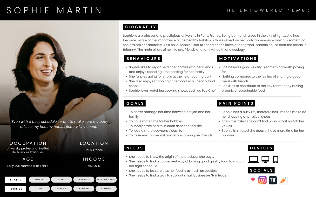
Our team worked with Poiscaille, a French eco-friendly seafood subscription service, to redesign their mobile buying funnel and e-shop. Focusing on a non-tech-savvy, 50+ audience, we created a mobile-first prototype to streamline the buying experience and improve transparency, which was well-received but remains unimplemented.
Solution: We simplified the buying process, redesigned product cards, and optimized delivery selection. The prototype was positively received by the stakeholders, though implementation is still pending.
Role in the project
Workshop leadership and stakeholder interviews
User data research (quantitative and qualitative)
Concept/design development
Figma Prototyping (Mid-Fi and Hi-Fi)
Software used
Figma
Google Forms
Adobe Illustrator
Poiscaille is a French seafood subscription service supporting local fishers through eco-friendly practices. In addition to their subscription model, they run an e-shop, aiming to improve their mobile buying funnel for better transparency and conversion. Our team (Felix Blanc, Lucas Ezcurra, and myself) was tasked with delivering research, user flows, and mobile wireframes to redesign the buying process.
Poiscaille’s e-commerce funnel wasn’t meeting users' needs, leading to confusion and drop-offs, which lowered the conversion rate and impacted brand trust.
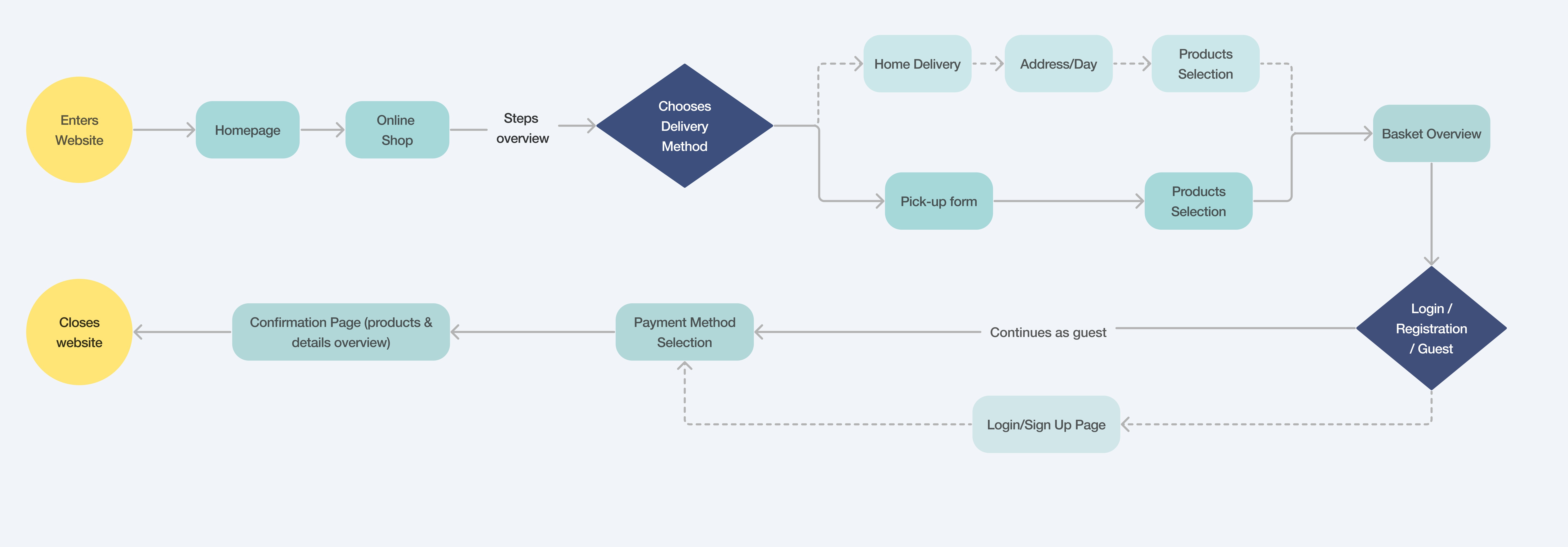
Current user flow highlighting potential drop-off points during the buying process.
Kick-Off & Research Process
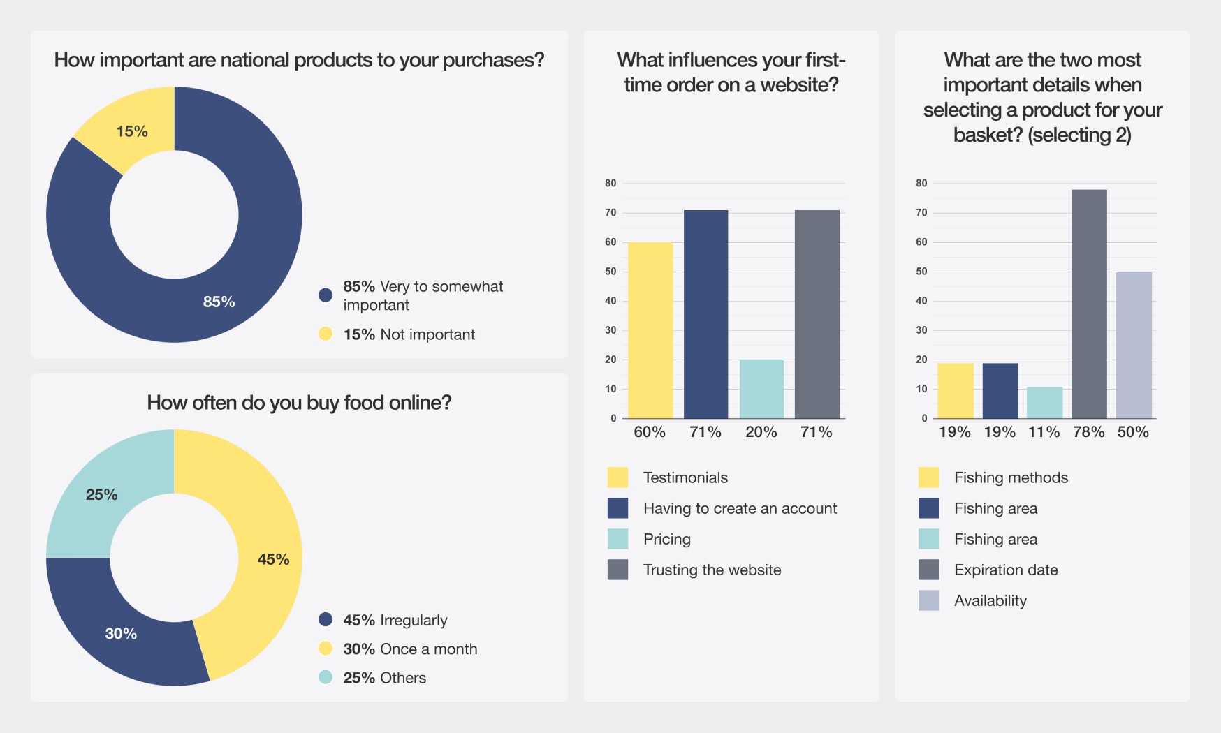
We began by reviewing Poiscaille’s user flow to identify potential drop-off points, preparing for a workshop with their head of product. Our research included a Lean UX Canvas, competitive analysis, and surveys targeting French consumers.
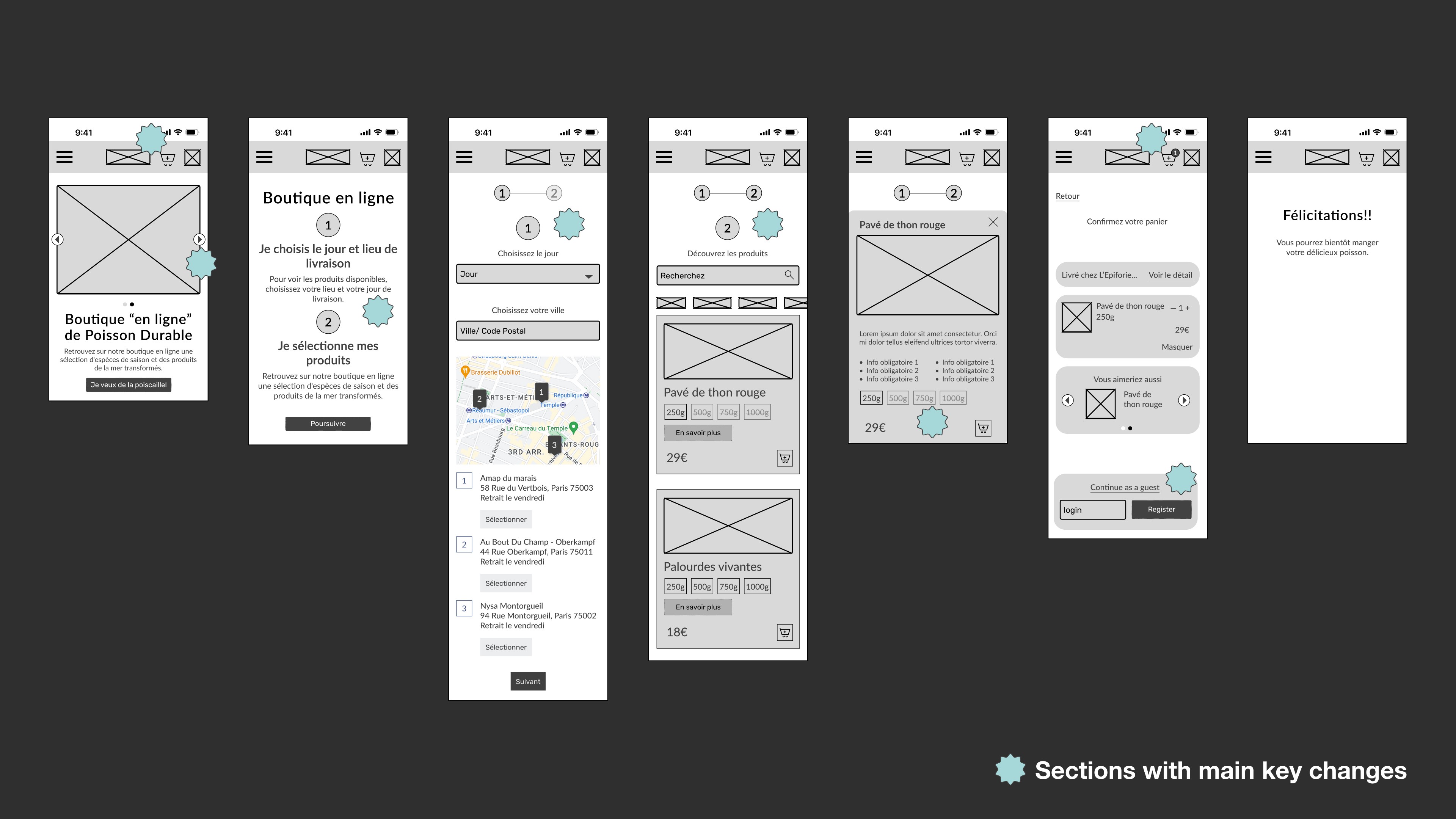
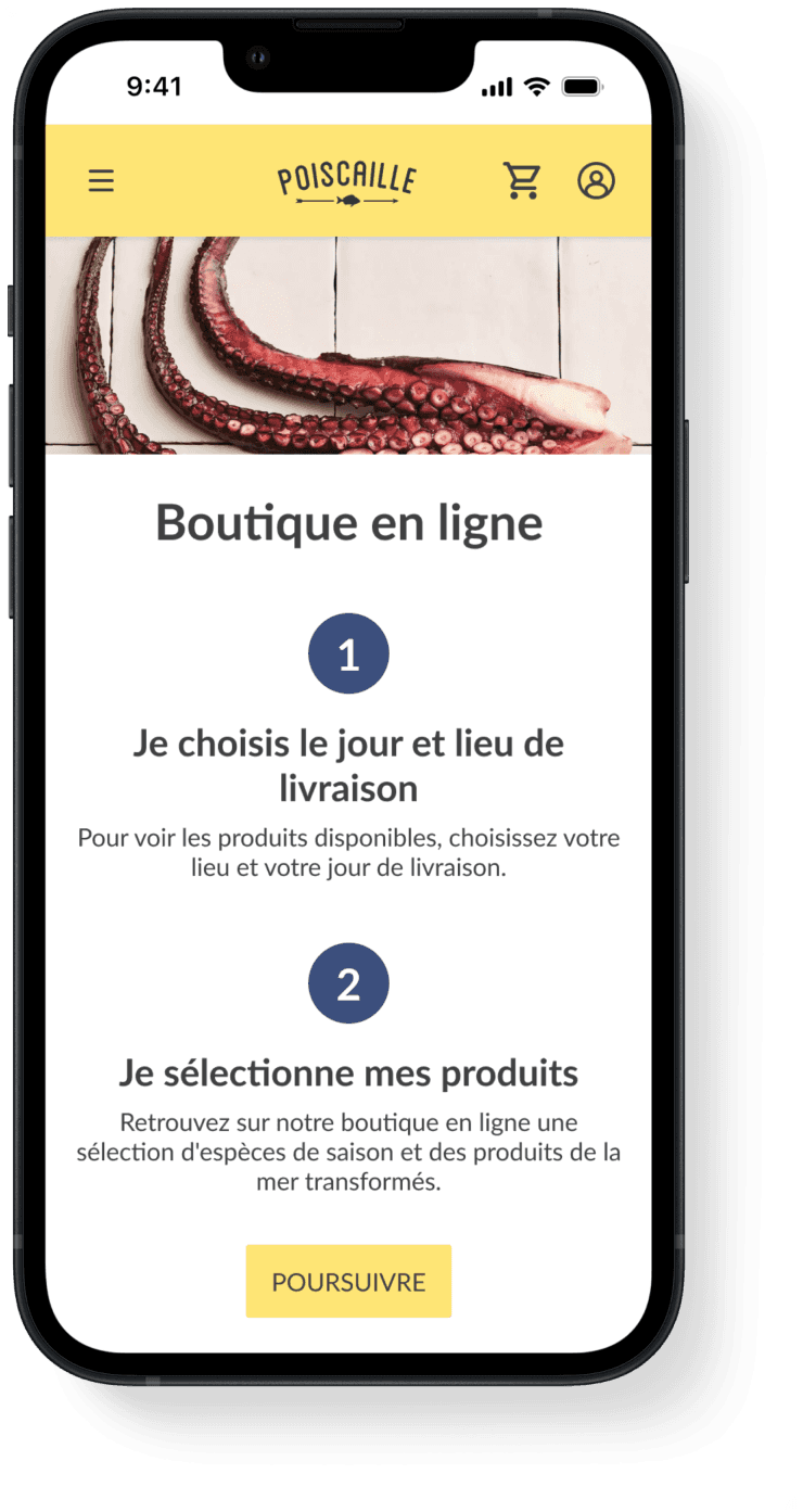
We streamlined the buying process by addressing key pain points, such as unclear collection info and forcing account creation. Our improved flow ensures users first select their preferred collection day, view available pick-up points, and can proceed as guests.
Design Process
Design Solution
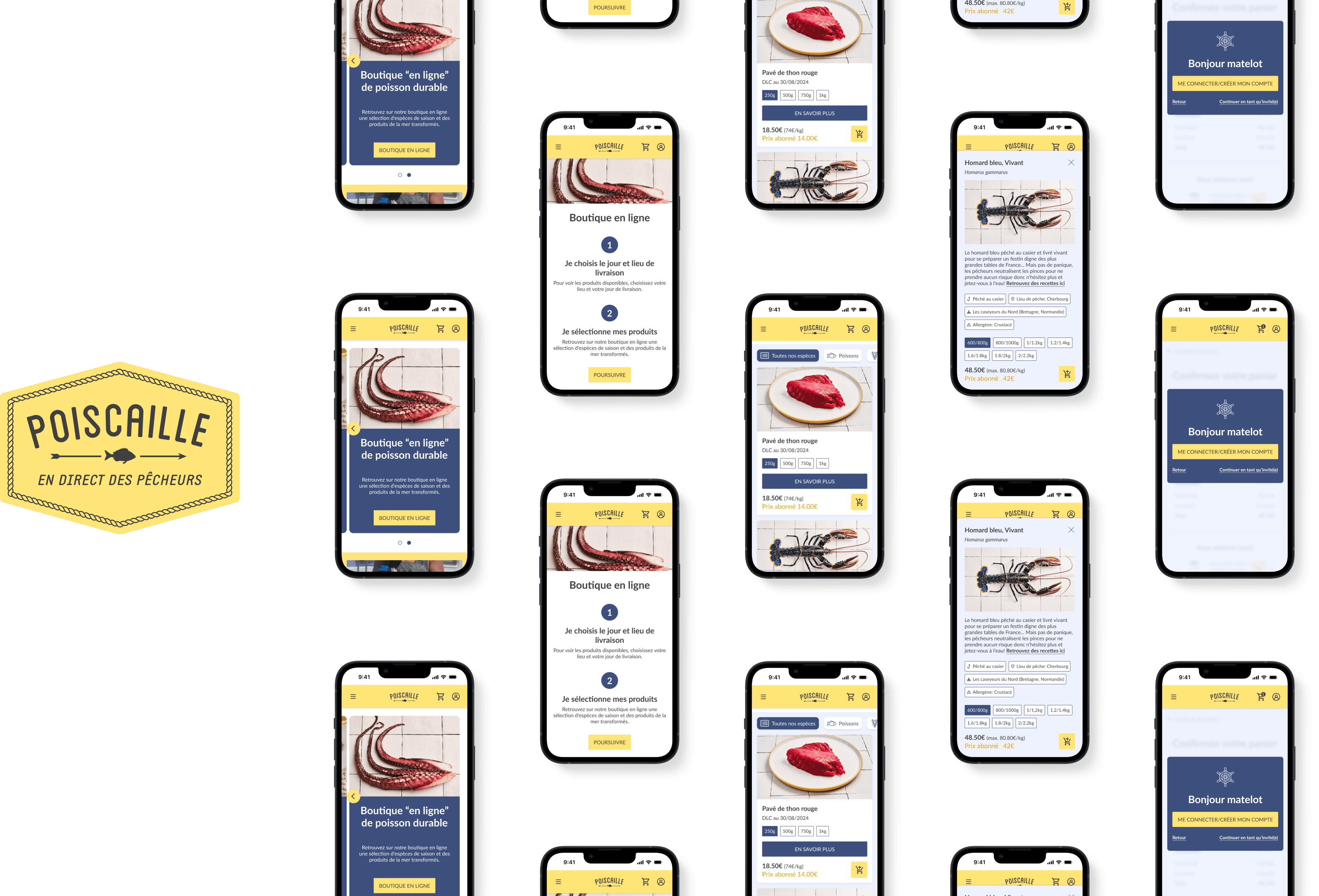
In response to user pain points and feedback from usability testing, we iterated on our wireframes and developed a more intuitive, streamlined buying process. This final design simplifies navigation, improves product visibility, and offers users more flexibility in their shopping experience.
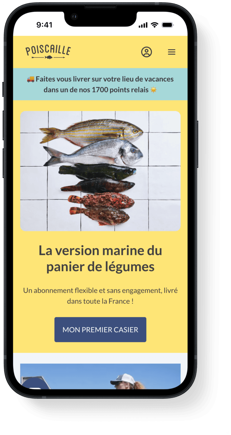
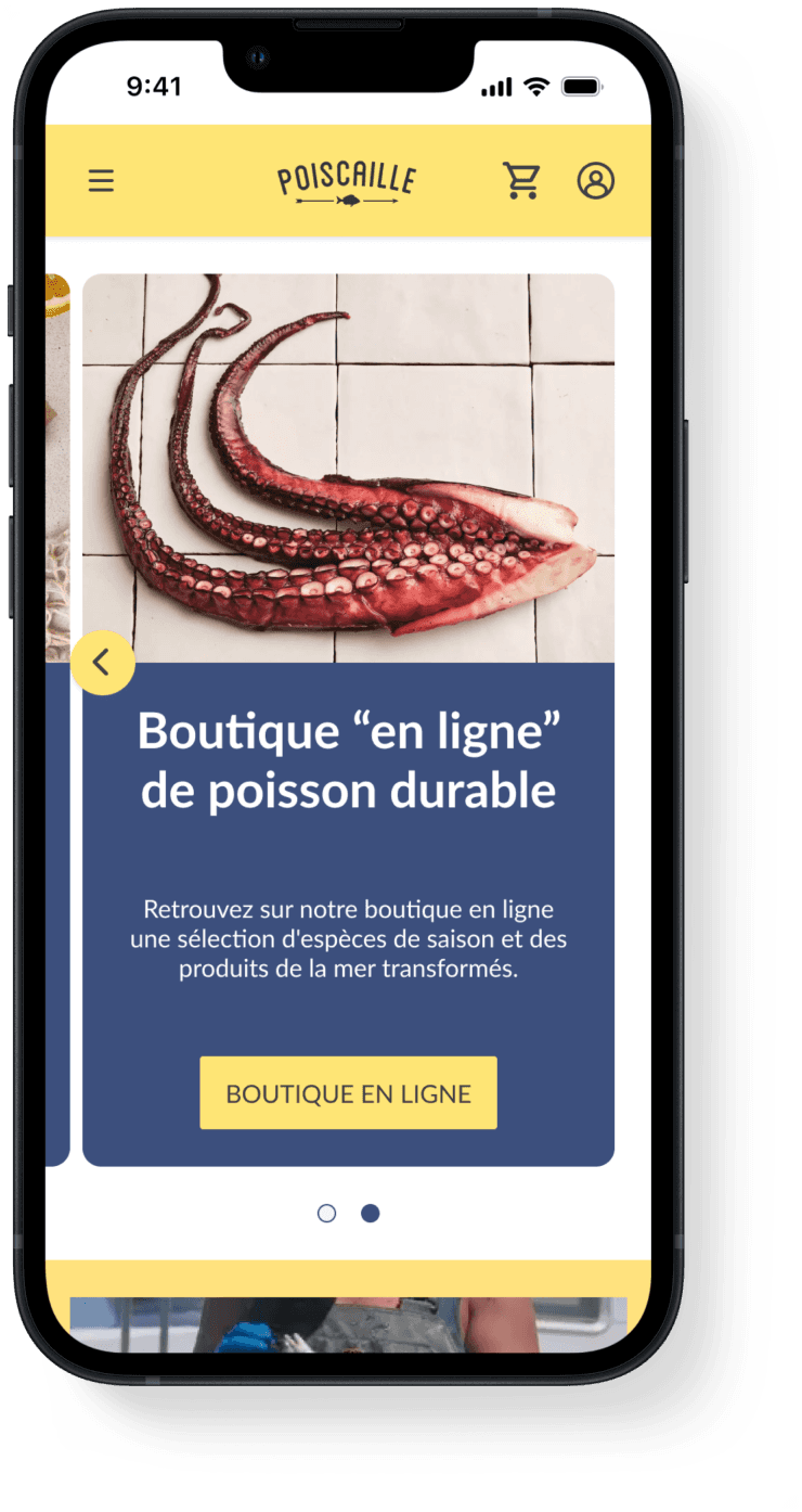
1. Homepage Redesign
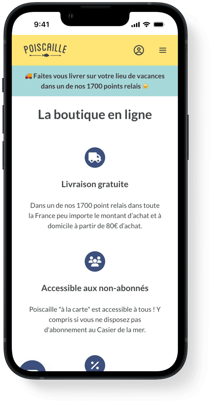
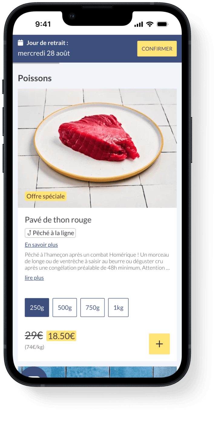
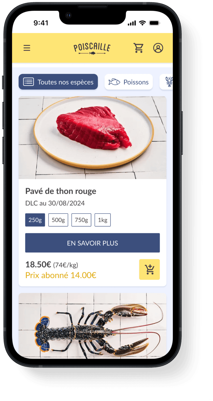
2. Online Shop Simplification
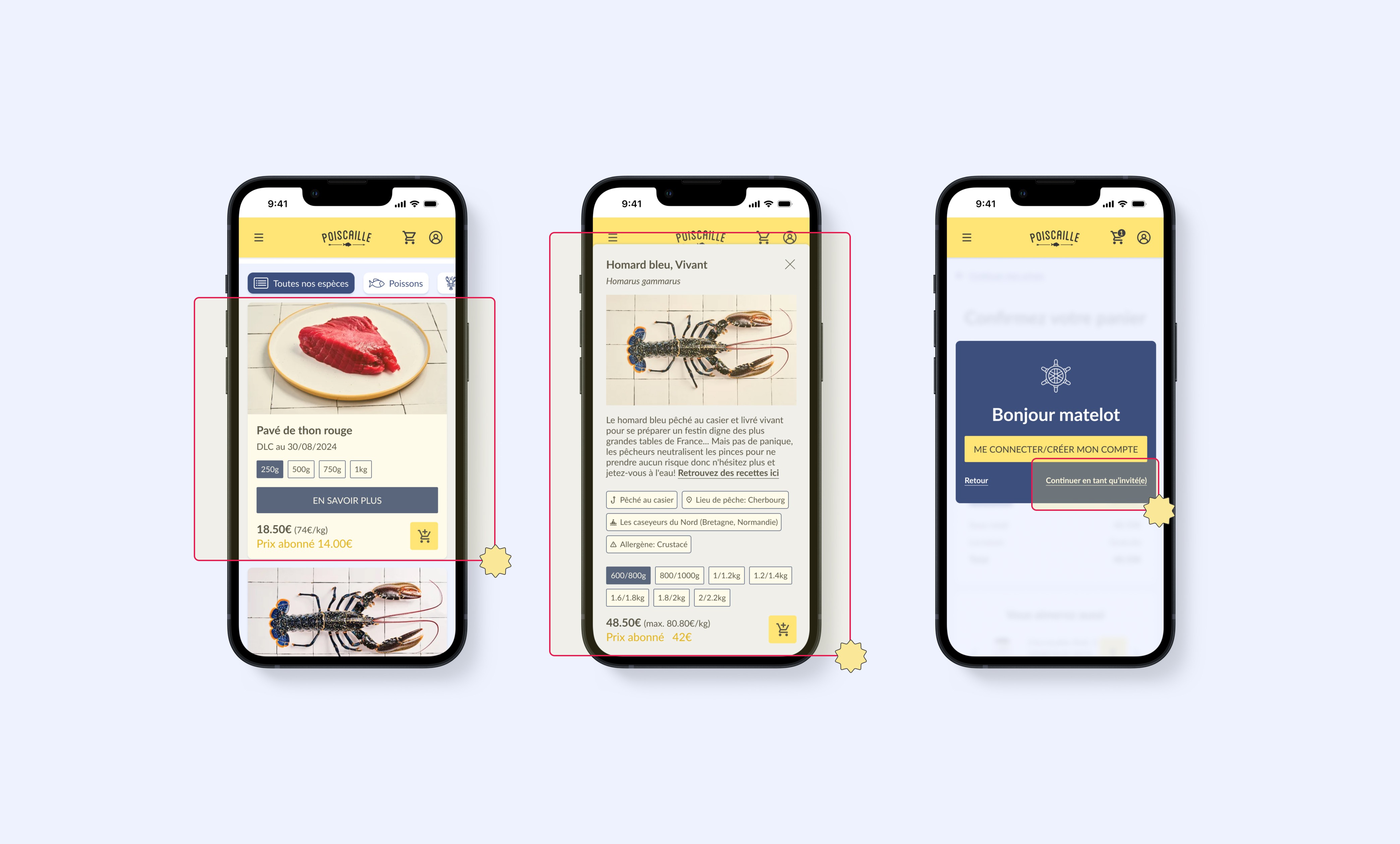
3. Product Card Overhaul
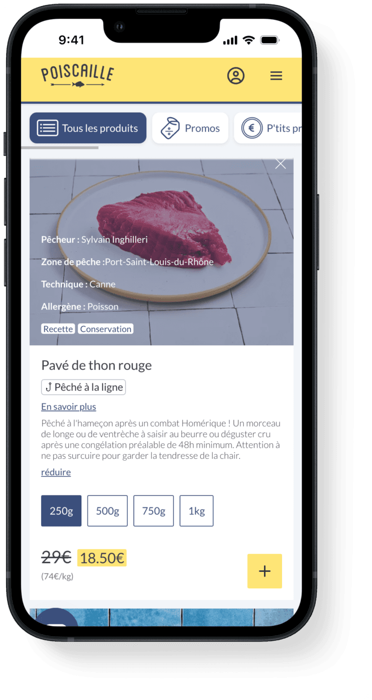
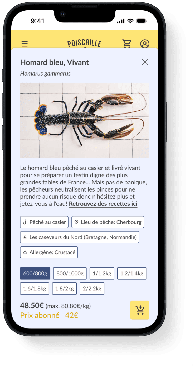
4. Detailed Product Info Overlay
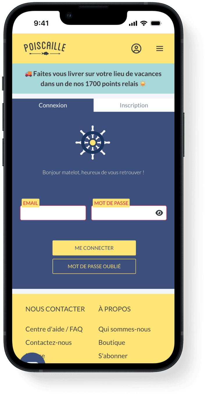
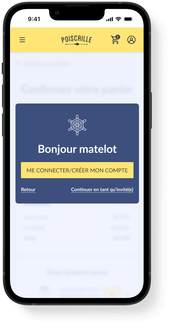
5. Guest Checkout Option
Key Results
Although Poiscaille has not yet implemented our design, the proposed solution addresses critical pain points identified during user testing. We anticipate an improved user experience with simplified navigation, reduced drop-off rates, and increased conversion, particularly by offering the 'guest checkout' option. The design is also expected to resonate with eco-conscious users, aligning with Poiscaille’s brand values.
